

Technical jargon is not new to the e-learning discipline. Given its interdisciplinary nature, borrowing from learning, motivation, training, technology, management, and what-have-you, this is not surprising at all. Just when you have familiarized yourself with the latest jargon, there is a new one lurking around the corner. And since technology is the medium of delivery in e-learning, most of us in the L & D profession are always trying hard to catch up with jargon that come into existence as a result of the ever-evolving technology trends.
Just as we settled down comfortably with Section 508 and WCAG 1.0, there came into being WCAG 2.0. SCORM compliance, a must-have feature, in the last decade has now been taken over by Tin Can or Experience API. And while we started to make our courses compatible with smart phones and tablets, there appeared a new kid in town – device-agnostic! And to confuse us more, the term comes with a full-fledged and close-knit family in tow – responsive, adaptive and mobile-friendly!
So, what does the term device-agnostic signify? And what does it imply from a learning perspective? What does it mean for those of us in the training and e-learning industry? How do we understand and adapt this term so that it is more meaningful from a learning design perspective (as against a website or webpage perspective)?
The bad news about this – the concept is still evolving and hasn’t reached a level of maturity as is evident from the web-based material that exists on the topic. Here are some popular definitions:
- A device-agnostic website is designed to accommodate visitors using mobile devices, desktops or televisions to visit the site.
- The real purpose of responsive designis to get to a point where your web design is completely device blind. Your design shouldn’t really care about the pixel dimension of the device it’s being viewed upon. That is what device agnostic design really is.
- Responsive design is device-agnostic because it focuses on users’ needs regardless of the device.
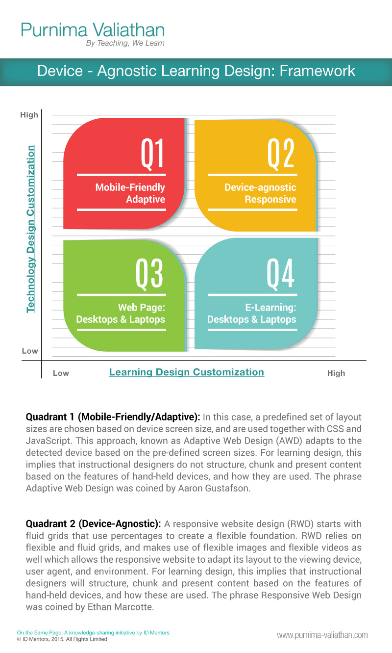
The good news – we can make an attempt to extrapolate the device-agnostic principle to learning design based on what web designers are writing and explaining about it. In this article, I derive my explanation and framework based on what Trent Walton, the web designer, has to say about “device agnostic”.
“With such a wide range of possibilities, the sensible thing to do is to zero in on the harshest conditions (or toughest things to deliver) and build from there. Like cars designed to perform in extreme heat or on icy roads, websites should be built to face the reality of the web’s inherent variability. In my mind this approach addresses the following from the beginning: Hostile browsers; Tiny screens; Slow connection speeds and Touch inputs.”
Tools
Type
Companies
0 responses on "Understanding Device-Agnostic Learning Design: Framework"